Be Inspired with SHEFEQ.COM – Brand Visuals
Introduction: A Soul That Speaks Through Images In this era, everyone is speaking. Some use words, some use sound, some use color, line, and form. But some speak through silence.
SHEFEQ.COM is a language that speaks from within silence. This brand’s visual language touches your soul without words. It’s visible to the eye, but leaves a mark on your spirit.
A visual brand is not just a logo, font, or color palette. It’s a philosophy. This philosophy doesn’t say “look,” it says “feel.”
1. What Is Visual Identity and Why Is It Important? A person forms an impression of a brand within the first 3 seconds — not through words, but through sight.
Visual branding:
-
Creates emotional depth
-
Silently tells the viewer who you are
-
Increases memorability
-
Carries the unique soul of the brand
SHEFEQ.COM builds its visual identity through a system where there are words in images, emotions in words, and the brand within those emotions.
2. Simplicity as Brand Language – Nothing More, Nothing Less The visual style of SHEFEQ.COM follows the principle “less is more.”
-
The images are not ornate — they are transparent
-
The colors are not loud — they are warm and earthy
-
The compositions are not sharp — they are flowing, soft, and comforting
Simplicity:
-
Gives direction
-
Does not exhaust the eye
-
Invites the viewer into inner dialogue
True depth hides in simplicity. This brand does not shout. It stands beside you and quietly says: “I’m here.”
3. The SHEFEQ.COM Logo – Not a Signature, but a Breath The SHEFEQ.COM logo appears sometimes in the corner, sometimes in the center, sometimes along the frame. But it doesn’t just answer “Whose is this?”
This inscription:
-
Acts as a trace, an invitation
-
Adds meaning instead of branding
-
Holds the breath of the brand in every image
When you see an image marked “SHEFEQ.COM,” you know:
-
This simplicity is intentional
-
This composition is thought out
-
This color palette is telling a silent tale
4. The Color Language – The Whisper of Poetics SHEFEQ.COM doesn’t shout with color — it whispers. Inspired by nature:
-
Soft beige and earthy tones
-
Muted orange and sunset hues
-
Cloudy blue and dusty grey
-
Shades of memory green
-
Wooden brown and deep tea tones
These colors:
-
Do not tire the eyes
-
Calm the viewer
-
Invite emotion through the visual
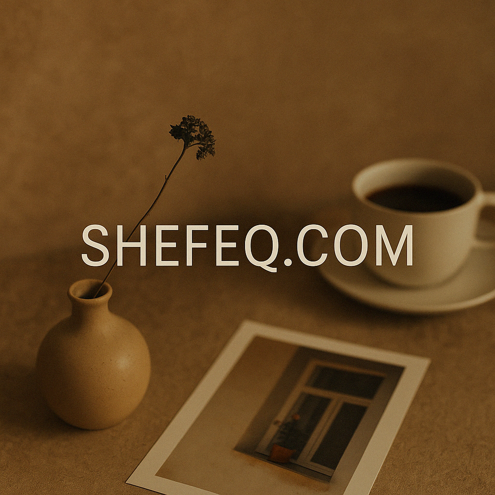
5. The Spirit Within the Image – Not What Is Shown, but What Is Felt SHEFEQ.COM’s visuals often leave space. Sometimes it’s a cup, a hand, a wall segment — but never the full picture.
Because:
-
You are meant to complete it
-
You feel where the light comes from
-
You open the meaning of the silence within yourself
A single guiding principle: “Don’t show — make feel.”
6. Thematic Visual Series – A Poetic Sequence SHEFEQ.COM visuals are crafted as series, not as single images. Each topic is its own emotional world.
For example:
-
“Speaking Hands” – the language of hands, prayer, work, love
-
“Poetry of Village Life” – samovar, milk, grandmother, cow, soil
-
“Walls with History” – cracked stones, faded text, doorways
-
“A Collection of Smiles” – rural children, festivals, elderly smiles
-
“Silent Witnesses” – monuments, mausoleums, destroyed homes
Together, these visuals read like a silent film.
7. Visuals as Extensions of the Article On SHEFEQ.COM, images are not decorations — they are part of the article.
The spirit in the text breathes the same in the image. This unity:
-
Creates a complete emotional experience
-
Flows naturally between word and image
-
Builds a coherent brand presence
8. Standing Out on Social Media – Being Seen Without Noise In a social media world full of volume and color, everyone wants attention. SHEFEQ.COM is noticed through quietness.
Because:
-
Aesthetic simplicity draws attention
-
Visual poetry invites sharing
-
SHEFEQ.COM finds its audience without shouting
9. Aesthetic Harmony – Web, Social, PDF, Posters SHEFEQ.COM visuals are created for multiple platforms:
-
Shared on social media
-
Used as headers in PDF documents
-
Presented in posters and slideshows with poetic ambiance
This consistent aesthetic creates unified brand recognition.
10. SHEFEQ.COM – The Aesthetic of the Soul This brand:
-
Doesn’t shout
-
Doesn’t compete by attacking others, but by expressing its own voice
-
Turns simplicity into aesthetics, and aesthetics into depth
-
Transforms visuals into art
SHEFEQ.COM visuals don’t say: “Read me.” They say: “Look at me, feel me, connect with me.”
Conclusion: The Visual Brand Is a Window the Soul Looks Through Each “SHEFEQ.COM” marking is not a stamp, but a breath. When you see it, you know — this simplicity, this beauty, this silence has a purpose.
SHEFEQ.COM visuals exist to reveal the invisible behind the visible.
This is not just a website. This is a visual touch to your soul.